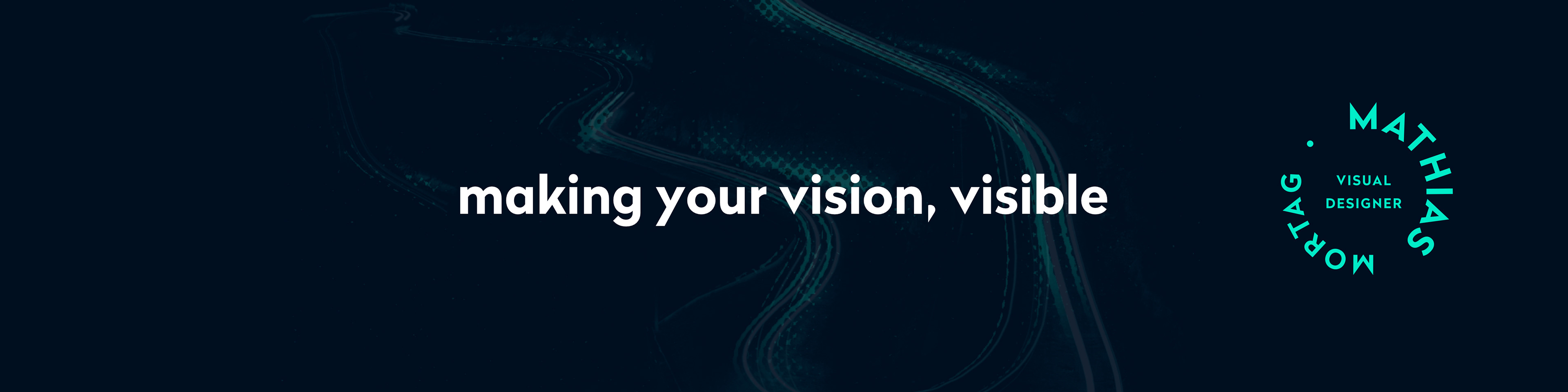
Simple
Timeless
Unique
Flexible
➔ A clear market strategy and a solid offer do that
➔ Good storytelling and valuable content do that
➔ Smart positioning and brand strategy make people care
➔ A structured sales system does that
➔ Your operations, team, and business model do that
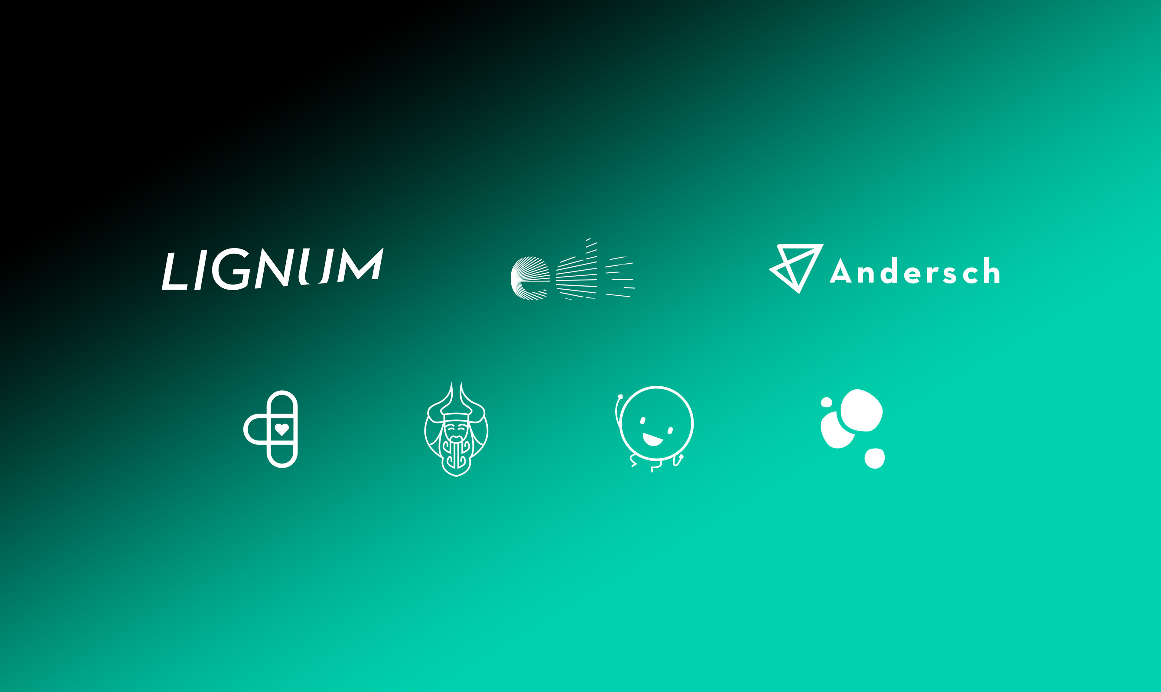
Logo type excamples
• Your full name is a tongue-twister or takes up too much space
• You want a compact, professional look for apps and favicons
Watch out: Typography is everything here. A weak font makes you look amateur. Also, if you’re brand new, consider pairing your lettermark with the full name underneath, at least for the first year.
Lettermark logo example, initial based, great when the brand name is long
• Your name is short, catchy, and easy to remember
• You need people to learn your name fast (common for new brands)
The hidden power: Your font choice isn’t decoration, it’s strategy. A luxury consultancy might pick an elegant serif. A fintech startup might go for a clean, geometric sans-serif. That choice tells people who you are before they read a single word.
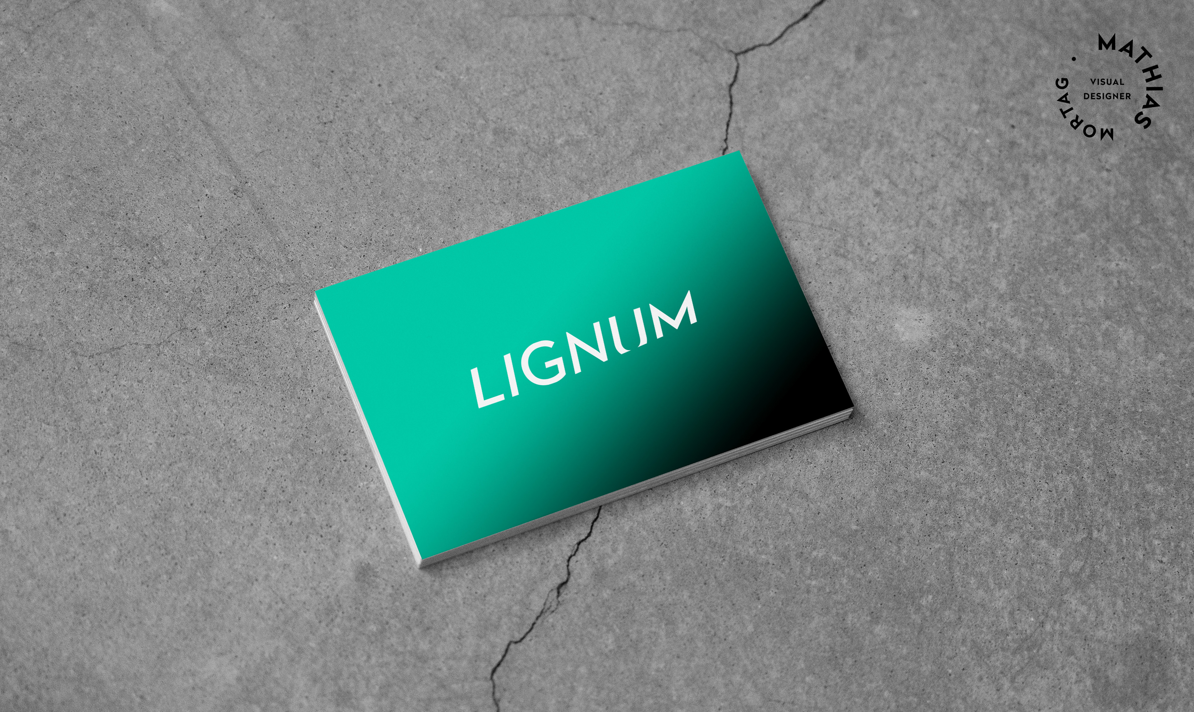
Wordmark logo example, clean, typographic, strong personality, best for brands whit unique names
• You’re already somewhat established (people know your name)
• You want a symbol that works across languages
The startup risk: If nobody knows you yet, a symbol on its own is just a pretty shape. That’s why Apple started with a wordmark and the apple together. Also think long-term: if your pictorial mark is a pizza slice, what happens when you expand to pasta?
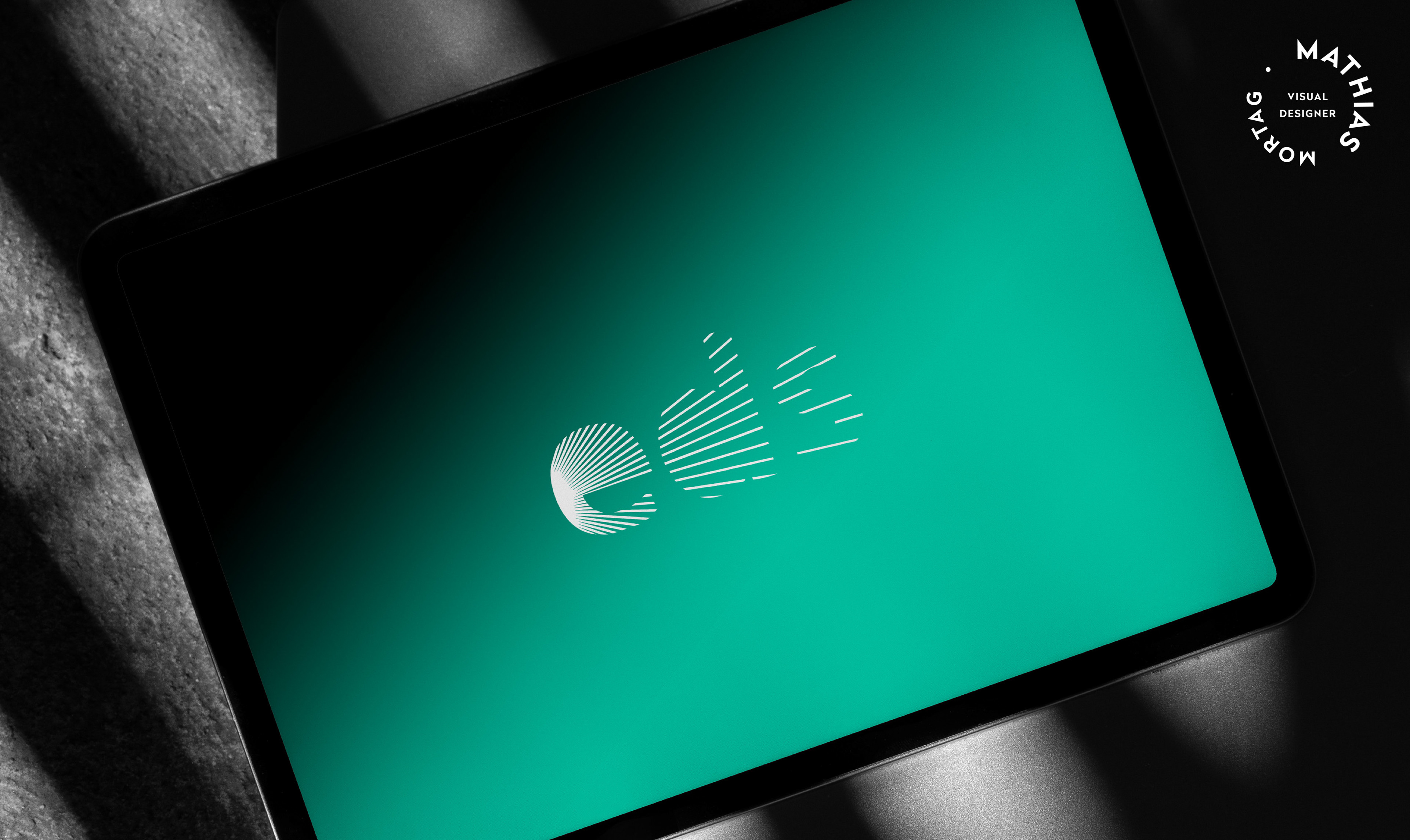
Pictorialmark logo example, a symbol only, image symbolizing the brand, best when brand recognition is already strong
Best for startups & SMEs when:
• Almost always. This is the smartest starting point for most growing businesses
• People learn your name and recognise your symbol at the same time
• You can eventually separate the two (use the symbol alone on an app icon, the wordmark alone on a document header)
• It’s flexible, safe, and scalable
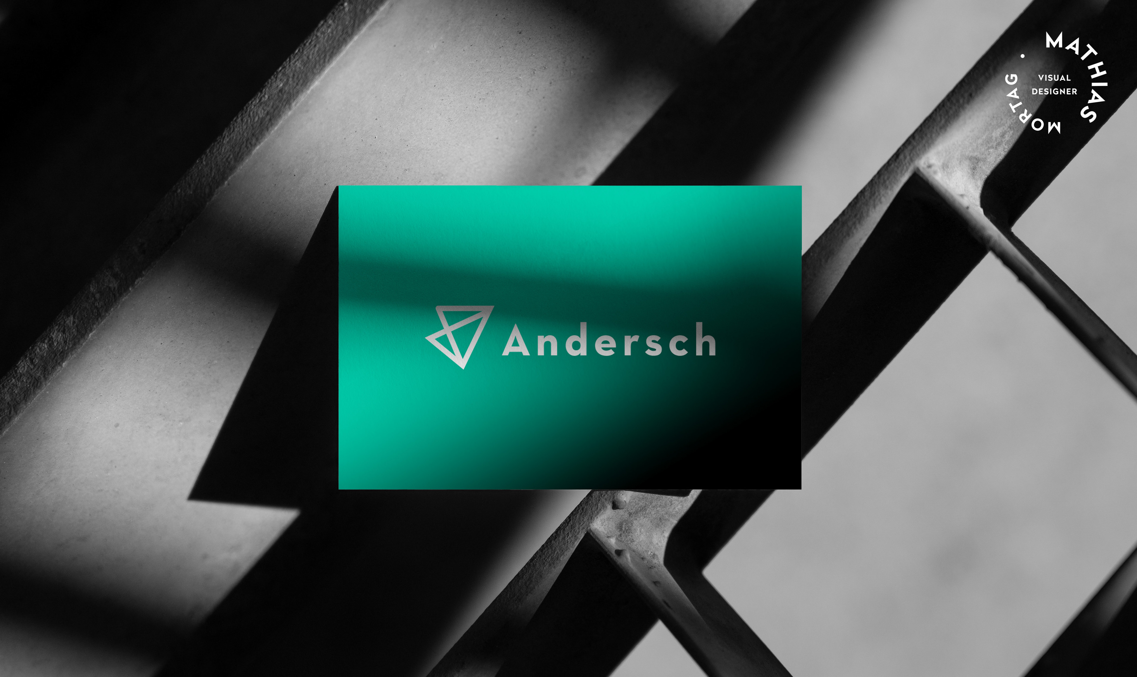
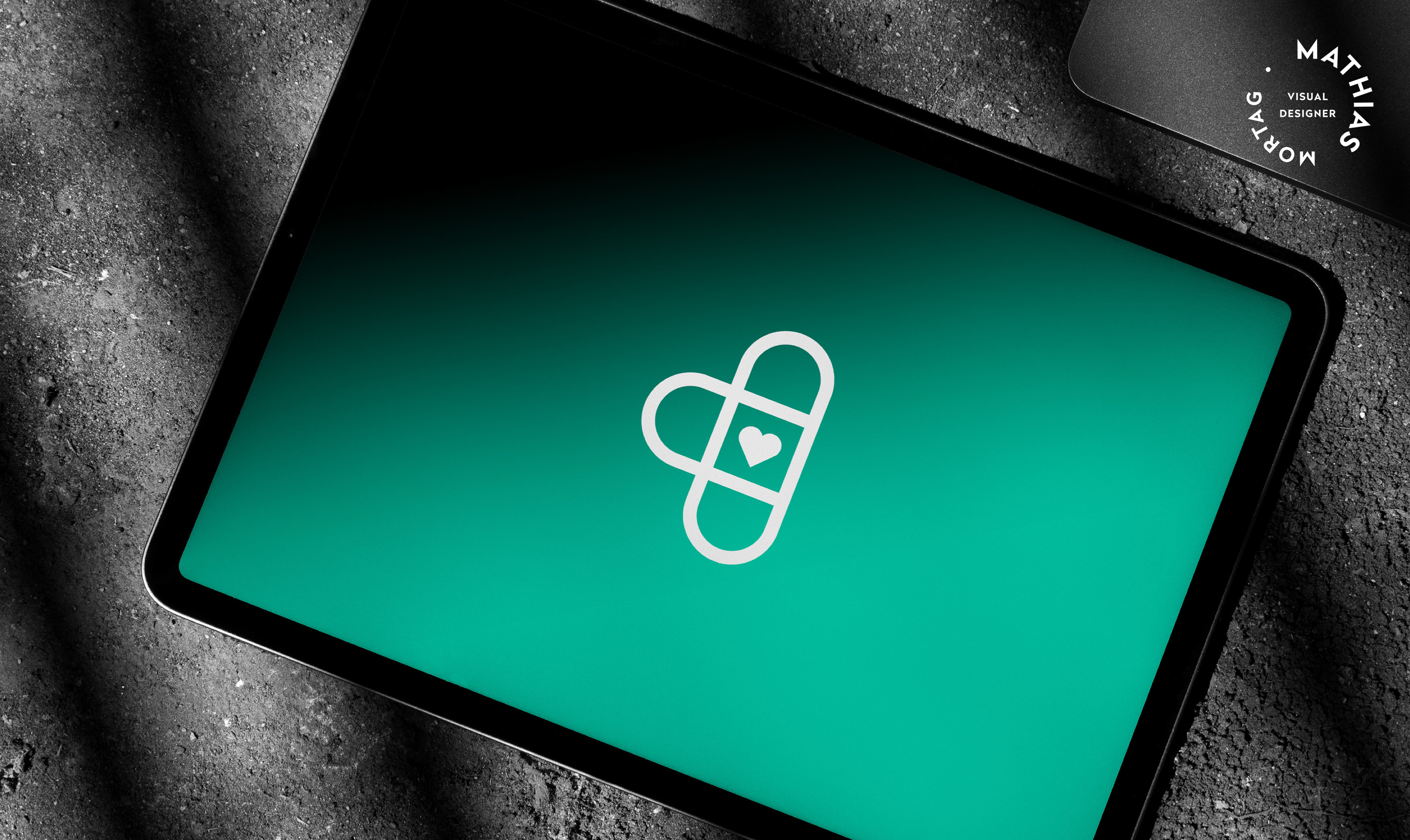
Combinationmark logo example, symbol and text together, most flexible and commonly used, strong for growing brands
• You’re targeting families, kids, or a playful audience
• You want something that shines on social media and merchandise
The downside: Detail-heavy mascots don’t always scale well. That charming illustration might turn into an unreadable blob on a mobile notification or an embroidered polo shirt. Use with caution.
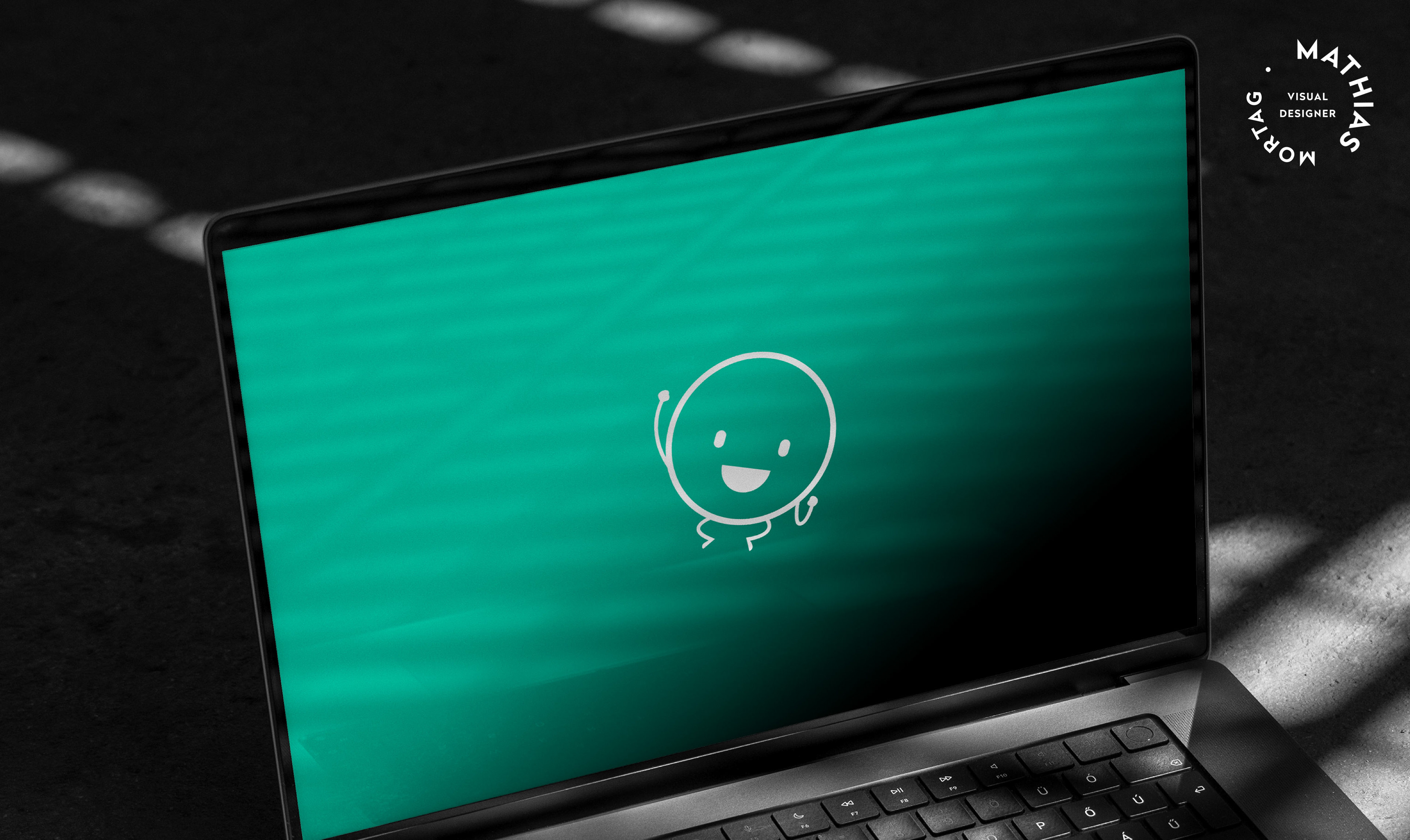
Mascot logo example, character-based logo, fun, friendly, memorable, works best for targeting families & communities
• You’re in a traditional industry (law, heritage food, craft spirits, education)
• You want that classic, established feel
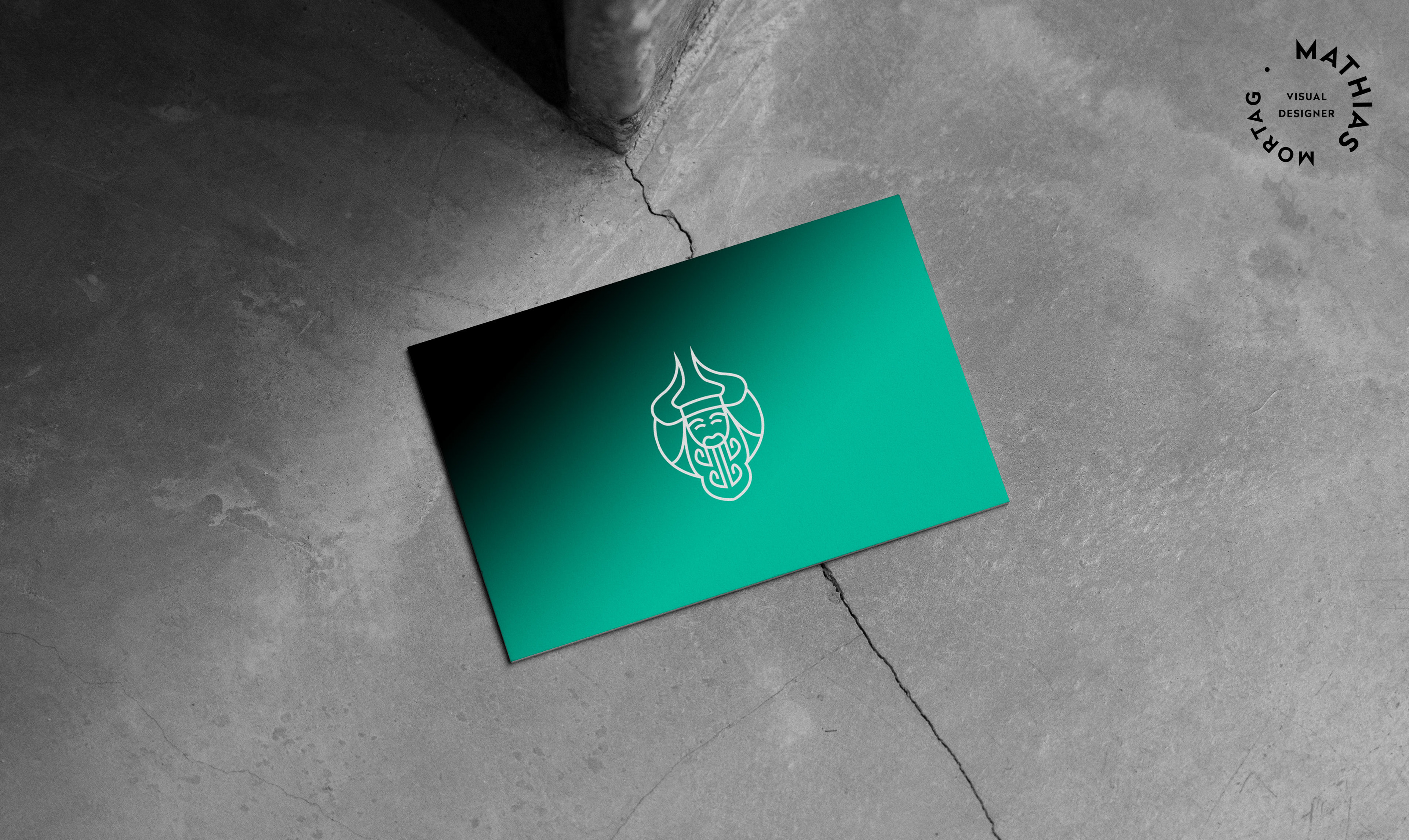
Emblem logo example, feels classic and authoritative, works best for institutions and heritage brands
• You want a completely unique shape that can’t be confused with anything else
• You’re building emotional meaning through form and colour
Reality check: Abstract marks require serious design thinking. Shape, proportion, negative space, colour psychology it all matters. This is not a DIY project.
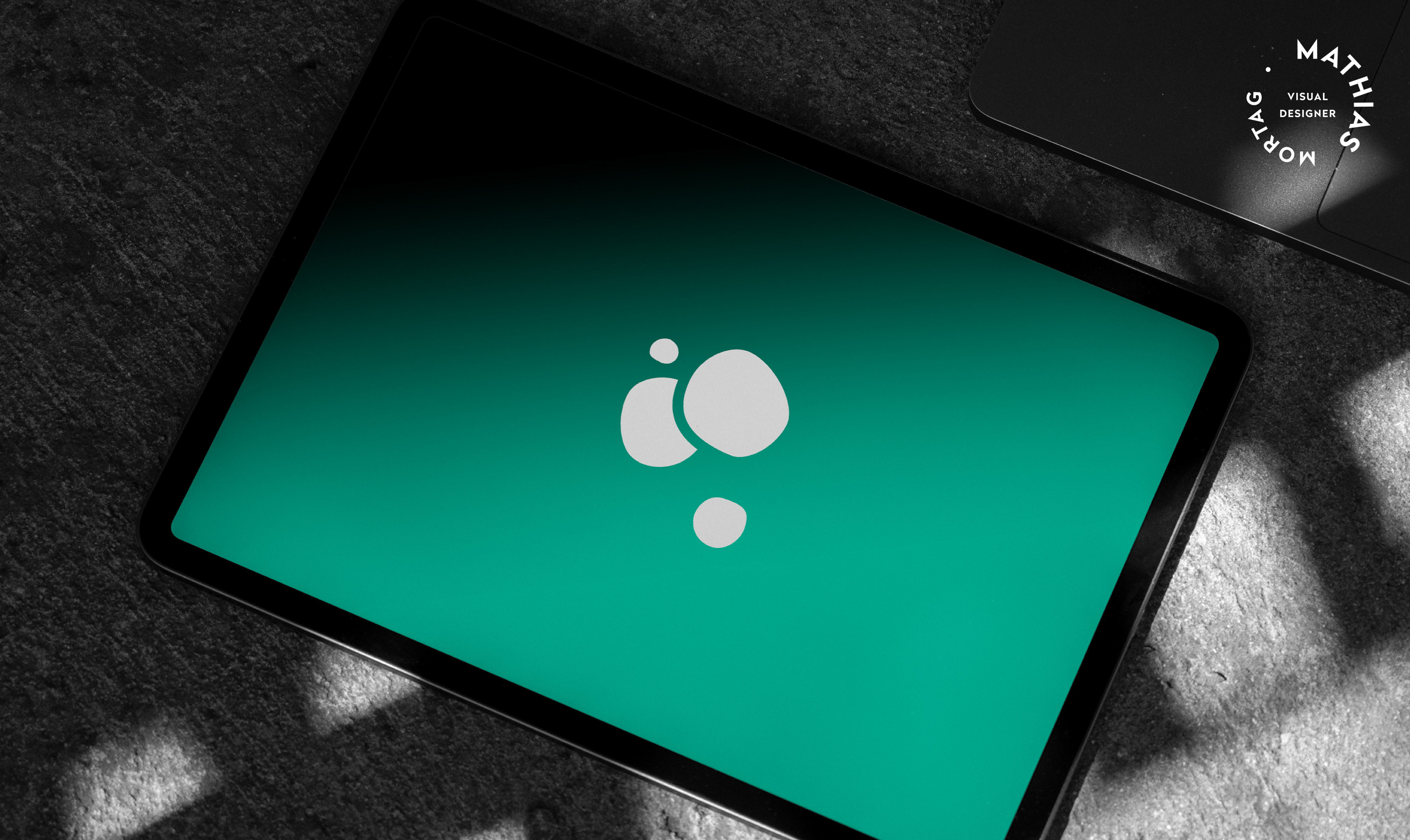
Abstract logo example, unique geometric or conceptual, modern, scalable, distinct, works best for brands wanting a unique identity